A case study of
Crescent City, CA (county)
User Scenario
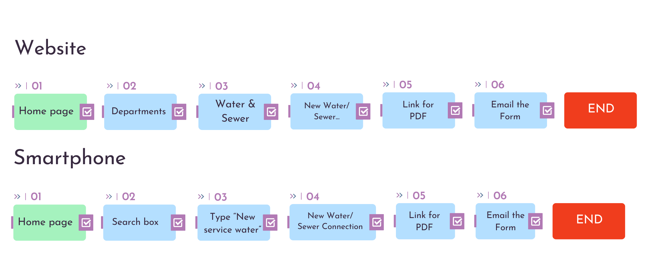
User Flows
Usability Heuristics Overview and Findings
In this list has a Heuristic Evaluation page by page from the website. Some stands outs are:
0 = No issues = No error was presented in any page/ The system let the user know where they are within a multi-step process
1 = Cosmetic = The interface use icons that are easily recognizable minus the Permits & Requests Icon one for example
2 = Minor = The user can’t easily undo or redo an action since it does not have a ‘Back’ button
3 = Major = The interface use language is not very familiar to the user in some parts for example
4 = Must fix = Create a page for the last form / The content has to prioritized the support of the user goals
Usability Recommendations (Home Page)
01 Visibility of system status
List not in alphabetical order
Titles not self-explanatory
No home menu
Recommendation:
Change buttons titles
Buttons and lists in alphabetical order
Change color of the option when moving the cursor
02 Aesthetic and minimalist design
Too much information
Recommendation:
Less info
Organize what are buttons or just text
Change images for icons
03 Match between system and the real world
Technical expressions
Recommendation:
Change the title of the button
Change icon
Usability Recommendations (Water and Sewer)
01 Aesthetic and minimalist design
Already have the General information at the bottom.
Recommendation:
Just keep this info in the bottom menu
02 Visibility of System Status
It does not showing that the user is in the Department section
Recommendation:
Make the Department rectangle bigger showing that the user is in there
03 Visibility of System Status
No need the use these language options since the Home page already has a change language option
Recommendation:
User the menu on the home page to change the language
Usability Recommendations (New Water and Sewer Connection)
01 Aesthetic and minimalist design
It is not clear the link for add new service
Recommendation:
Make a button for apply for new service
02 Aesthetic and minimalist design
Already have the General information at the bottom.
Recommendation:
Just keep this info in the bottom menu
Usability Recommendations (PDF Form)
01 Consistency and standards
Should not be a PDF form because that can confuse user if this is part of the website
Recommendation:
Make this part of the site as a page or just add it at the bottom of the New Water/Sewer Connection Page
Usability Recommendations (Mobile - Home)
01 Visibility of system status
List not in alphabetical order Icons on top of titles
Recommendation:
Use same image from the website as a background for mobile too
02 Aesthetic and minimalist design
Too much information
Recommendation:
Make this page less long with less info
Change images for icons
03 Match between system and the real world
Main information on the ‘hamburger’ menu instead of the main page
Recommendation:
Change menu options for the options from the hamburger menu
Usability Recommendations (Mobile - Water and Sewer Connection)
01 Consistency and standards
Bad spacing
Color discordination
Recommendation:
Organize the info so the website can be consistent
Change colors
Less space on paragraphs
Better display of the info
Cognitive Walkthrough
Suggestions for improving the navigation
To improve navigation I would indicate:
A more modern design with more current icons
More obvious search box for the user
Cleaner pages
Keep the same background pattern, as well as
Make recommendations for improving the navigation
Use more icons and buttons.
Add more information in a different menu would be ideal as the site has a lot of information and with that, it can be confusing to see.
Keep a pattern of colors and fonts would help the user a lot to understand where he is and obviously adding a page (or adding it to an existing page) to the submission form for a new water service is fundamental.
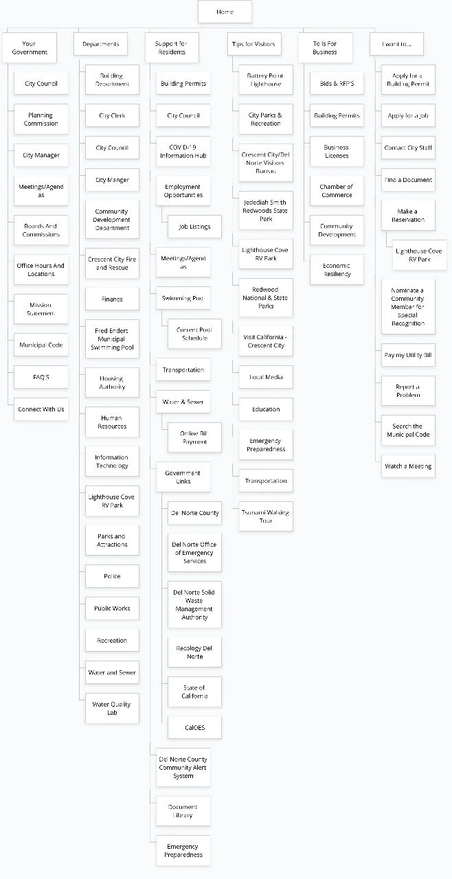
Sitemap
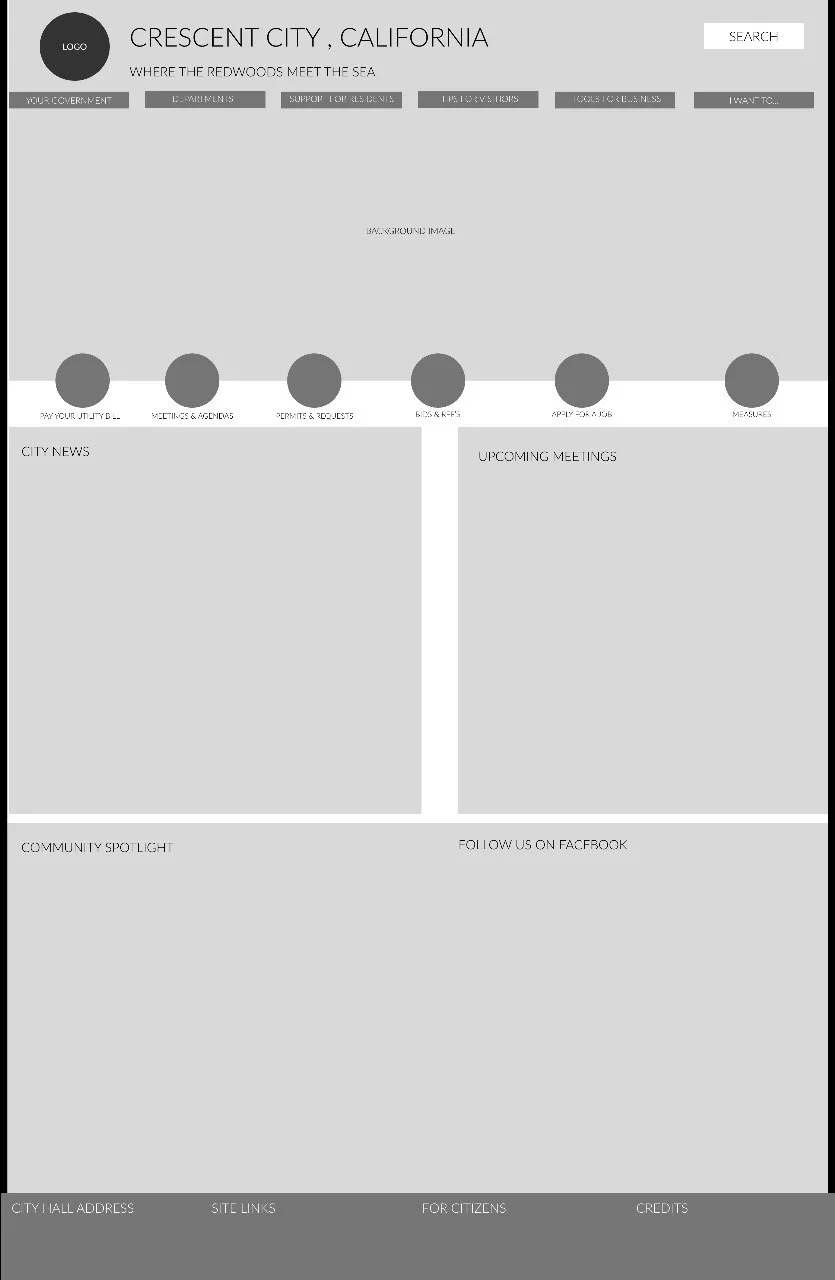
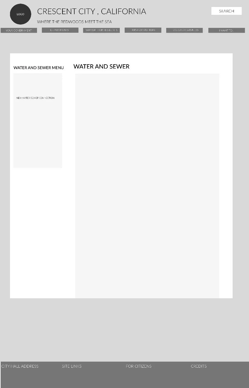
Navigation Wireframes - Website
UI Design Elements
Interactions from Low-fi to Mid-fi
A/B Test
I took the AB test using Usabilityhub.com taking in consideration only the Home Page of the original website and my version. Among 17 tests collected, everyone preferred my version and one of the feedbacks that most caught my attention was this one:
“Ok I chose the one in black and white, because the information is more compressed, the menus are accessible. The other has a lot of information that perhaps does not need to be in plain sight. I liked the division of 4 categories of most important news… The color has a thousand articles everywhere”
By Anonymous
5 seconds test
I took the 5 seconds test using Usabilityhub.com asking the testers what were they considering from a 5 seconds look at the new design of the home page. Among the 10 tests collected, we got some useful feedback. We asked: “What was your overall impression of the page?” And some of the answers were”
“I was laid out nicely”
“Neatly organized”
“Love the colors choice”
“Clean and well organized”
By Anonymous


